How to Build a Remote-Friendly Home Assistant Dashboard for Apple TV
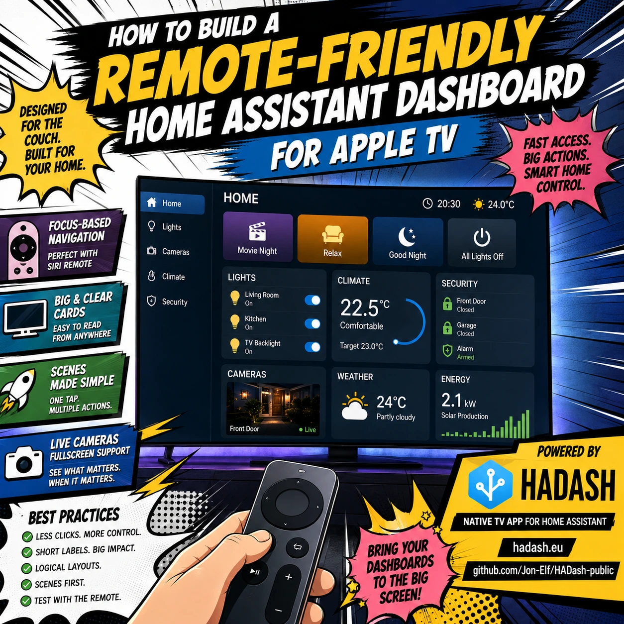
A Home Assistant dashboard that works perfectly on a phone or tablet is not automatically a good Apple TV dashboard.
The difference is the way you interact with it.
On a touchscreen, you can tap any point on the screen, drag sliders, open small controls, and scroll quickly. On Apple TV, navigation is based on focus: the remote moves from one selectable element to another, and you then select the focused item.
Apple describes tvOS as a directional focus-based interface in which users move focus between onscreen components with the remote before selecting an action.
That means a good Home Assistant dashboard for Apple TV should be designed differently from a dashboard intended primarily for a browser, phone, or wall tablet.
This guide explains how to build a remote-friendly Home Assistant dashboard for Apple TV, including card selection, navigation, layouts, cameras, scenes, lights, climate controls, and common UX mistakes.
HADash is a native tvOS application designed to display and interact with existing Home Assistant dashboards on Apple TV. You can find the product at HADash official website and the public project documentation and card compatibility information at HADash GitHub repository.
Why Apple TV Dashboards Need Different Design
Home Assistant dashboards are made from views and cards. Cards can display information, control devices, run actions, show cameras, display weather, graph sensor history, and much more.
On a phone, the user can directly touch whichever card they want.
On Apple TV, the user has to navigate through the interface.
That changes the most important design question.
Instead of asking:
How much information can I fit on this screen?
ask:
How quickly can someone reach the action they want with the remote?
That principle should guide almost every design decision.
1. Start With a Separate Apple TV Dashboard
Do not simply reuse your main Home Assistant dashboard.
Home Assistant supports multiple dashboards specifically so different interfaces can be created for different users, devices, rooms, and purposes. Its documentation gives examples such as a focused kitchen tablet dashboard, a guest dashboard, and a more detailed personal dashboard.
Create a dedicated TV dashboard.
A useful starting structure is:
Home
Lights
Cameras
Climate
Security
That is usually enough.
Your phone or desktop dashboard can continue to contain advanced configuration, detailed graphs, battery sensors, automation controls, and diagnostics.
The Apple TV dashboard should contain only the information and actions that make sense from the couch.
2. Design Around Focus Navigation
Apple’s tvOS interface uses directional focus.
The user moves the focused state from one interface element to another and then explicitly selects an item. Apple also notes that every interactive onscreen element on tvOS should be reachable through focus navigation.
For Home Assistant, this means the physical relationship between cards matters.
Imagine this arrangement:
Movie Night | Relax | Good Night
Living Room | Kitchen | Hallway
Front Door | Climate | Security
The user can understand where focus will move.
Now imagine:
- six different card sizes;
- tiny controls between larger ones;
- nested stacks;
- sliders;
- cards placed asymmetrically;
- several unrelated widgets.
Navigation becomes harder to predict.
Better rule
Build visual rows and logical groups.
The interface should almost feel like a television menu rather than a desktop dashboard.
3. Use Fewer Cards on the Main Screen
The Home view should not become a smart-home database.
A practical TV Home screen may need only eight or ten controls.
For example:
Movie Night
Relax
Good Night
Living Room Lights
TV Backlight
Indoor Temperature
Front Door
Front Door Camera
Security Status
All Lights Off
Everything else can live in secondary views.
The fewer elements the remote must move through, the faster the dashboard feels.
4. Use Sections for Predictable Layouts
Home Assistant currently offers several view layouts, including Sections, Masonry, Panel, and Sidebar.
For an Apple TV dashboard, Sections is usually the best place to start.
Home Assistant’s Sections layout organizes cards in a grid and allows them to be grouped into logical sections. It also lets you configure the maximum number of sections across the screen.
For example:
Scenes
Movie Night
Relax
Good Night
Lights
Living Room
Kitchen
TV Backlight
Home Status
Temperature
Front Door
Security
This structure is easier to understand from a distance and easier to navigate with directional input.
Full Sections documentation: Home Assistant — Sections view
5. Do Not Use Too Many Columns
A large TV might tempt you to create five or six columns.
That does not mean you should.
A television is large physically, but it is also viewed from several meters away.
Three clearly defined groups are usually better than six narrow groups containing tiny cards.
A reasonable starting point is:
2–3 major columns or sections per screen.
For cameras or large graphs, use even fewer.
6. Make Important Cards Large
The most frequently used actions deserve the most visual space.
For example:
Movie Night should not be a tiny button hidden beside six sensor cards.
Give important actions:
- larger cards;
- clear icons;
- short names;
- predictable locations.
The Home Assistant Sections layout supports card resizing, making it possible to give important controls more space.
7. Prefer Short Labels
Compare:
Activate Evening Living Room Lighting Automation
with:
Evening
Or:
Turn Off All Ground Floor Lighting Devices
with:
Downstairs Off
Or:
Front Entrance Door Contact Sensor
with:
Front Door
The user does not need to see Home Assistant’s internal implementation terminology.
The dashboard should communicate the result of an action, not its technical architecture.
8. Scenes Are Perfect for Apple TV
Scenes are particularly well suited to remote control because one button can replace several individual device operations.
Instead of navigating through:
Ceiling Light
Floor Lamp
TV Backlight
Dining Light
Blinds
Hallway Light
you can offer:
Movie Night
When activated, the scene can configure those devices together.
Another button might be:
Relax
Another:
Guests
Another:
Good Night
This dramatically reduces remote navigation.
9. Put Scenes Before Individual Devices
A useful Apple TV Lights view might be structured like this:
Scenes
Movie Night
Relax
Reading
Guests
Good Night
Main Lights
Living Room
TV Backlight
Dining Area
Other Lights
Kitchen
Hallway
Exterior
The actions most likely to be used from the sofa appear first.
Detailed device controls remain available, but they do not dominate the screen.
10. Button Cards Work Well With a Remote
Home Assistant’s Button card is one of the simplest interaction patterns for television use.
Buttons work particularly well for:
- scenes;
- scripts;
- lights;
- switches;
- simple actions.
HADash currently lists Button Card as supported in its public compatibility documentation.
Current compatibility information: HADash card support on GitHub
11. Be Careful With Sliders
Sliders are natural on touchscreens.
They are less natural on television interfaces.
Think about adjusting a light:
On a tablet you touch the brightness slider exactly where you want.
With a remote you may need to:
- Navigate to the card.
- Enter the control.
- Adjust the value.
- Exit the control.
- Continue navigating.
If users constantly adjust brightness manually, a tablet may be better for that task.
On Apple TV, scenes often provide a cleaner alternative:
Lights 25%
Lights 50%
Movie Night
Reading
12. Avoid Tiny Interactive Elements
Apple specifically recommends making focus states clear and warns that focused interface elements can visually increase in size on tvOS.
For a Home Assistant dashboard, avoid layouts containing many small adjacent actions.
Poor TV interface:
Light 1 | Light 2 | Light 3 | Light 4 | Light 5 | Light 6
Better:
Living Room
Main Lights
Lamps
TV Lighting
All Off
Even better:
Relax
Movie Night
Reading
All Off
13. Use Standard Home Assistant Cards First
Home Assistant provides built-in cards for many common smart-home functions, including lights, thermostats, weather, buttons, entities, sensors, pictures, graphs, and other devices.
Full card documentation: Home Assistant — Dashboard Cards
For Apple TV, start with standard cards.
They tend to be:
- simpler;
- more predictable;
- easier to navigate;
- easier for native applications to support.
Only add custom cards when they provide something genuinely necessary.
14. Check HADash Card Compatibility
HADash renders supported Home Assistant cards natively rather than behaving as a general web browser.
According to the current public compatibility list, supported cards include examples such as:
- Button Card
- Light Card
- Thermostat Card
- Vertical Stack Card
- Heading Card
- Sensor Card
- Clock Card
- Entity Card
- Entities Card
- Gauge Card
- Weather Card
- Statistics Graph Card
- Markdown Card
- Picture Card
- Picture Entity Card
Compatibility changes as the app develops, so check the current list before designing a dashboard around a particular card.
Current list: HADash GitHub — Cards Support
15. Avoid Designing Around Unsupported Custom Cards
One of the easiest ways to create compatibility problems is to build an Apple TV dashboard entirely around browser-specific custom cards.
Custom Home Assistant cards can depend on:
- JavaScript;
- browser events;
- custom CSS;
- touch gestures;
- popup systems;
- external libraries.
A native tvOS application cannot automatically reproduce every browser component.
For the TV dashboard, standard Home Assistant cards should form the foundation.
Keep complicated browser dashboards for your desktop or tablet.
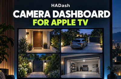
16. Cameras Deserve Their Own View
Cameras are one of the strongest reasons to use Home Assistant on a large television.
Rather than squeezing multiple live feeds into the Home screen, create a dedicated Cameras view.
For example:
Cameras
Front Door
Driveway
Garden
Garage
HADash currently supports Picture Entity cards for cameras and its public changelog includes fullscreen camera functionality.
This makes the TV particularly useful for checking:
- doorbell activity;
- driveway movement;
- garden cameras;
- garage cameras;
- entrance gates.
17. Use One Large Camera When Detail Matters
Four camera feeds can provide a useful overview.
But if you actually need to identify something, use one large feed.
Home Assistant’s Panel view displays one card across the full width of the view, making it useful for content such as a large image or specialized display.
A camera-focused structure could therefore be:
Camera Overview
Front Door | Driveway | Garden | Garage
Then:
Front Door Fullscreen
for detailed viewing.
18. Do Not Overload the Camera View
More live streams mean more work for:
- Home Assistant;
- the network;
- cameras;
- client hardware.
Showing eight live streams simultaneously may look impressive but offer little practical value.
Start with the cameras people actually check.
For many homes that means:
Front Door
Driveway
Garden
Garage
Four is usually plenty.
19. Climate Should Be an Overview First
Climate controls can become complex.
A thermostat may expose:
- current temperature;
- target temperature;
- mode;
- fan;
- presets;
- humidity;
- schedules.
On Apple TV, start by showing what matters most:
22.5°C
Target 23°C
Heating
Humidity 48%
Then expose only the controls that people realistically use from the sofa.
HADash currently lists Thermostat Card as supported. GitHub
20. Build a Simple Security View
A TV security dashboard should answer:
Is everything normal?
For example:
Front Door — Closed
Patio Door — Closed
Garage — Closed
Living Room Window — Closed
Alarm — Armed
Garden Motion — Clear
Then include selected cameras.
This is more useful than showing every security entity Home Assistant contains.
21. Be Conservative With Dangerous Controls
A television is normally a shared device.
Anyone with access to the remote may potentially reach controls displayed on the dashboard.
Be cautious with:
- unlocking doors;
- opening garage doors;
- disabling alarms;
- security gates;
- potentially dangerous equipment.
A status-only card may be more appropriate than an actionable control.
22. Put Information Before Action Where Appropriate
Not every dashboard element needs to be clickable.
Some cards are useful simply because they show information.
Examples:
22.5°C
Front Door Closed
Alarm Armed
3 Lights On
Solar 2.1 kW
Weather 24°C
The Home screen can therefore combine a small number of actionable controls with passive status information.
23. Use Large, Simple Graphs
Large television screens can display graphs extremely well.
Useful examples include:
- temperature;
- energy consumption;
- solar production;
- humidity;
- air quality.
Avoid putting several tiny graphs side by side.
A secondary Energy or Climate view can present one or two large graphs that are easy to read from the couch.
HADash’s public documentation includes Statistics Graph Card support and History Graph functionality in its changelog. GitHub
24. Reduce the Number of Remote Clicks
Every frequently used action should be evaluated by one metric:
How many remote movements does it take to reach it?
Suppose Movie Night requires:
Down
Right
Right
Down
Right
Select
That is probably too much for one of the most common living-room actions.
Move Movie Night to the first screen.
The most important controls should ideally require only a few directional movements.
25. Keep Navigation Consistent Across Views
If Scenes are at the top of Home, consider keeping important controls near the top of other views too.
Avoid completely changing the logic of every screen.
For example:
Home
Scenes → Status → Camera
Lights
Scenes → Main Lights → Secondary Lights
Climate
Current Conditions → Controls → History
Security
Status → Doors → Cameras
Users learn the interface through repetition.
26. Do Not Create Too Many Views
Home Assistant supports multiple views inside each dashboard. A view functions as a tab and controls the layout of the cards it contains.
But Apple TV navigation should remain simple.
For many homes:
Home
Lights
Cameras
Climate
Security
is enough.
You probably do not need:
Living Room
Dining Room
Kitchen
Hallway
Bedroom 1
Bedroom 2
Bathroom
Garage
Garden
Energy
Network
Batteries
System
on the television.
Keep those detailed interfaces elsewhere.
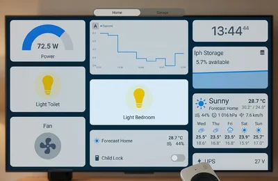
27. A Good Home View Should Work From the Couch
Here is a practical example.
HOME
Scenes
Movie Night
Relax
Good Night
Lights
Living Room
TV Backlight
All Downstairs Off
Status
22.5°C
Front Door Closed
Alarm Armed
Camera
Front Door
A user sitting on the sofa can immediately understand the state of the house and activate the most common actions.
28. Recommended Lights View
LIGHTS
Scenes
Movie Night
Relax
Reading
Guests
Living Room
Main Light
Floor Lamp
TV Backlight
Nearby Rooms
Kitchen
Dining Room
Hallway
Global
Downstairs Off
All Lights Off
This gives both high-level scenes and individual control without overwhelming the user.
29. Recommended Camera View
CAMERAS
Primary
Front Door
Additional Cameras
Driveway
Garden
Garage
Use large camera cards rather than filling the screen with unrelated sensors.
If a camera needs attention, open it fullscreen.
30. Recommended Climate View
CLIMATE
Living Room
22.5°C
Target 23°C
Heating
Humidity 48%
Outside
24°C
Humidity 55%
Air
CO2 620 ppm
Air Quality Good
History
Temperature Graph
This is enough for normal household use.
31. Recommended Security View
SECURITY
Home
Alarm Armed
Front Door Closed
Patio Door Closed
Garage Closed
Windows
Living Room Closed
Kitchen Closed
Bedroom Closed
Motion
Garden Clear
Garage Clear
Camera
Front Door
Again, focus on exceptions and important state.
32. Consider Conditional Visibility
Home Assistant cards support conditional visibility, allowing certain information to appear only under specified conditions.
This can make a TV dashboard much cleaner.
For example, only show:
Kitchen Window Open
when the window is actually open.
Only show:
Low Battery
when attention is required.
Only show:
Garden Motion Detected
when motion exists.
When everything is normal, the screen stays calm.
33. Exceptions Should Be Visually Obvious
Imagine the normal state:
Front Door — Closed
Garage — Closed
Windows — Closed
Alarm — Armed
Nothing should demand attention.
Now imagine:
Patio Door — OPEN
That should stand out.
A good dashboard visually prioritizes abnormalities rather than making every sensor equally prominent.
34. Avoid Excessive Scrolling
Long dashboard pages are acceptable on phones.
They are much less pleasant with a remote.
If a TV view requires repeated vertical scrolling, consider splitting it into another view.
For example:
Do not create one huge screen containing:
Lights
Climate
Cameras
Security
Energy
Weather
Instead create dedicated views.
35. Design From the Actual Seating Position
Do not finish the dashboard while sitting 50 centimeters from a computer monitor.
Open it on the television.
Sit where you normally sit.
Then check:
Can you read the temperature?
Can you immediately see which card is focused?
Can you identify Movie Night?
Can you tell whether the front door is open?
Can you navigate without thinking?
If not, simplify it.
36. Test With the Real Siri Remote
Mouse testing is not enough.
A layout that seems logical with a pointer may feel completely different when focus moves directionally.
Test:
- left;
- right;
- up;
- down;
- select;
- back.
Watch where focus goes.
If the result is surprising, reconsider the card arrangement.
Apple’s focus guidance explicitly emphasizes predictable directional navigation for tvOS interfaces.
Apple’s focus documentation: Apple Human Interface Guidelines — Focus and Selection
37. Optimize for the Most Common 80% of Actions
Do not design the TV dashboard for every theoretical Home Assistant operation.
Think about what actually happens in the living room.
Perhaps:
40% — Movie Night
20% — lights
15% — front-door camera
10% — climate
10% — security status
5% — everything else
Your dashboard should reflect that distribution.
The most common actions should be easiest to reach.
38. Keep Administration Off the TV
There is usually no reason to put these on the Apple TV dashboard:
- automation editor;
- integration status;
- firmware updates;
- device diagnostics;
- network statistics;
- logs;
- detailed battery monitoring;
- Home Assistant configuration.
Use your phone, tablet, or desktop for administration.
The television should remain an operational interface.
39. Use a Dedicated Home Assistant User
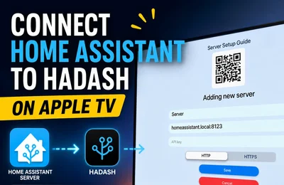
HADash connects directly to a Home Assistant instance using a Long-Lived Access Token. Its current setup documentation explains how to create the token and add the Home Assistant server inside the app.
For a shared television, using a dedicated Home Assistant user can make the installation easier to manage separately from your personal account.
Treat the Long-Lived Access Token like a password.
Never publish it or include it in screenshots.
Full HADash setup documentation: HADash setup and documentation
40. HADash Can Use Existing Home Assistant Dashboards
You do not need to rebuild your smart-home configuration inside the Apple TV app.
HADash connects to Home Assistant and displays supported content from existing dashboards. Its public documentation describes the app as bringing existing Home Assistant dashboards to the big screen without requiring dashboard reconfiguration inside HADash itself.
This means the Apple TV workflow is:
Home Assistant creates the dashboard.
HADash displays and controls the supported dashboard content.
Product: HADash for Apple TV
Development and compatibility: HADash Public GitHub Repository
Common Apple TV Dashboard Mistakes
Mistake 1: Copying the Mobile Dashboard
A mobile dashboard is optimized for touch.
Create a dedicated TV version instead.
Mistake 2: Too Many Cards
If everything is important, nothing is important.
Move secondary information into additional views.
Mistake 3: Too Many Tiny Controls
Large screen does not mean tiny controls become comfortable.
Remember viewing distance.
Mistake 4: Too Many Sliders
Convert frequent combinations into scenes whenever possible.
Mistake 5: Complex Custom Cards Everywhere
Check native compatibility first.
Mistake 6: Cameras Hidden Deep in Navigation
If cameras are frequently used, give them their own top-level view.
Mistake 7: Long Entity Names
Use human-readable labels.
Mistake 8: Unpredictable Card Placement
Build clear rows and sections.
Mistake 9: Designing With a Mouse Only
Always test using the actual remote.
Mistake 10: Trying to Put the Entire Smart Home on One Screen
The TV dashboard is a control surface, not an inventory.
A Practical Apple TV Dashboard Blueprint
If you want a simple starting point, build this:
View 1: Home
Movie Night
Relax
Good Night
Living Room Lights
TV Backlight
Temperature
Front Door
Security
Front Door Camera
All Lights Off
View 2: Lights
Lighting Scenes
Living Room
Kitchen
Dining Room
Hallway
Exterior Lights
All Lights Off
View 3: Cameras
Front Door
Driveway
Garden
Garage
View 4: Climate
Living Room Temperature
Target Temperature
Humidity
Thermostat
Air Quality
Temperature History
View 5: Security
Alarm
Front Door
Patio Door
Garage
Windows
Motion
Front Door Camera
This provides a useful smart-home interface without turning Apple TV into a complicated administration console.
Frequently Asked Questions
What is the best Home Assistant dashboard layout for Apple TV?
Should I create a separate Home Assistant dashboard for Apple TV?
Which Home Assistant cards work best on Apple TV?
Are Home Assistant scenes useful on Apple TV?
Typical examples include Movie Night, Relax, Guests, Reading, and Good Night.
Can I show Home Assistant cameras on Apple TV?
Should I use custom Home Assistant cards on Apple TV?
Check the current compatibility list first.
How many cards should be visible on the Home screen?
Is Apple TV good for detailed Home Assistant configuration?
Can HADash use an existing Home Assistant dashboard?
Final Thoughts
Building a good Home Assistant dashboard for Apple TV is primarily a UX problem.
The goal is not to reproduce the entire Home Assistant interface on the largest screen in the house.
The goal is to make the most useful smart-home actions easy to reach with a remote.
Start with:
- scenes;
- main lights;
- cameras;
- climate;
- security status;
- a few important sensors.
Use large cards.
Keep labels short.
Create predictable rows and sections.
Move detailed controls into secondary views.
Avoid interfaces designed primarily around touch interaction.
And most importantly, test the dashboard from the couch with the actual Apple TV remote.
Home Assistant provides the dashboard system and cards.
HADash provides the native Apple TV interface for supported Home Assistant dashboards.
Current HADash development information, setup instructions, changelog, and card compatibility are available in the HADash public GitHub repository.
Sources
Home Assistant — Dashboards https://www.home-assistant.io/dashboards/
Home Assistant — Dashboard Cards https://www.home-assistant.io/dashboards/cards/
Home Assistant — Dashboard Views https://www.home-assistant.io/dashboards/views/
Home Assistant — Sections View https://www.home-assistant.io/dashboards/sections/
Apple Developer — Focus and Selection https://developer.apple.com/design/human-interface-guidelines/focus-and-selection
HADash — Official Website https://hadash.eu/
HADash — Public GitHub Repository https://github.com/Jon-Elf/HADash-public